The excitement for Type Camp Toronto has been a long time coming. We had been planning this event for months, and we were so excited to finally see it come to life last weekend.
Type Camp was founded by Dr. Shelley Gruendler and has become an educational tool for people wanting to learn more about typography and design. Taught by amazing instructors from all over the world, workshops have been popping up on the international scene for the last few years, including India, Brazil, and Japan. Ligatures was pleased to help bring Type Camp to Toronto for the first time.
Type Camp Toronto was lead by Dr. Shelley Gruendler & Carol Fountain Nix, and was setup as 2 one-day sessions. To get the full experience – and meet as many typophiles as possible – Leslie attended the Friday session, and Chris & Kyle participated on Saturday. This recap is an amalgamation of our three experiences during this amazing weekend.
Day 1: Friday (by Leslie Harrod)
With a tea in hand, I quickly jogged to the Design Exchange (I was worried about being late as I know Shelley doesn’t tolerate lateness – ha!). I had never been to an event at the DE building, so this was shaping up to be a great experience. I wasn’t too sure about what to expect, but I knew I was in good hands when both Shelley and Carol introduced themselves.

Shelley started off with a group exercise to break the ice, which allowed each of us to get to know each other – the infamous "Name Game". It was a little intimidating, but within minutes, we all knew each other, and could get right into the course.

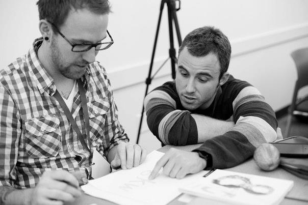
From start to finish, it was an amazing experience. Carol was unbelievable. I don’t really think there are any other words to describe her. Watching her work was mesmerizing. Your mouth couldn’t help but drop every time her brush slowly glided across the paper – the result were the sexiest letters you’ve ever seen. She was very supportive and guided our techniques. Looking over all my test papers throughout the workshop from beginning to end, you could see the difference Carol’s guidance was doing. With Shelley available to give suggestions & feedback, the techniques came to life on the page. I can’t say enough how inspiring and motivational this course was.
How can I forget about the people I got to meet as well! There were such amazing and talented individuals from all over the country – even as far as Montreal. It was great to get to know each other and learn more from one another. As we all received the post-Camp e-mail from Shelley and Carol with everyone’s contact info, I truly hope that we can build and get to know each other. It will be wonderful to meet again and share what we’ve learned from this – as well as other projects that have inspired us – in the coming months.

Day 2: Saturday (by Christopher Rouleau)
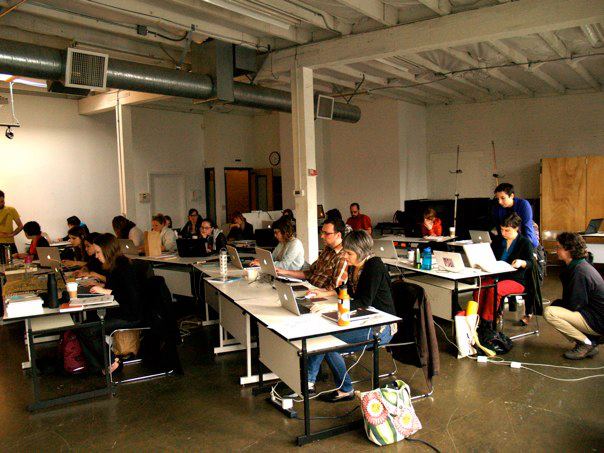
Saturday morning started bright and early. I grabbed an espresso and then met Shelley & Carol at the Design Exchange to help set-up around 8:30am. Each spot at the conference table had a sketchbook with each individual's name written with pointed pen, and there was paper, ink and writing tools aplenty. Within 30 minutes, the boardroom was filled with 16 eager (and caffeinated!) participants, all ready to expand their lettering horizons.
Shelley gathered us in a circle and welcomed the group, gave a brief history & overview of Type Camp, and then helped us all get introduced to each other by playing the "Name Game" (essentially, introducing yourself and the person/people beside you). It was a pretty challenging request for a Saturday morning, but totally helped unite the group.

Then, it was straight to work. From 9:00am until lunch, we worked on a variety of calligraphy exercises, using a broad nib pen. Our work included creating consistence vertical strokes, perfecting our rounded strokes, and then practicing basic lower case characters. Some people remained seated at the table, while others were encourage to work standing upright. Once we were warmed up, we started working on lettering full words like "limit" and "georgia". After each exercise, we would convene, review and critique the group's work. Throughout the morning, Carol provided superb tutorials using ink and larger calligraphic tools.


We paused for lunch, and resumed right around 1:15pm. For the remaining 3.5 hours, we left the broad nib behind and embraced a more casual approach to lettering with brush pens. Here, we were encouraged to "loosen up" and allow for a more free form of writing. Carol introduced us to "automatic writing", a form of continuous doodling which resembles letterforms but doesn't actually spell anything. The effect is chaotic, spontaneous, and quite beautiful.

Using the knowledge we gained in the morning (dominant brush strokes, consistency, brush angle, etc.), each student was encourage to find their lettering "voice". Exercises included "bad lettering" (creating words in a style opposite to their inherent meaning), collaging letters as a group, and proposing a hand-lettered wordmark for an existing company brand. By the end of the afternoon, it was INCREDIBLE to see everyone's creative transformation.

I left the Design Exchange shortly after 5:00, exhausted but completed changed. I was so grateful to have had the opportunity to work with Shelley and Carol. What an amazing day!

Thank you Type Camp! We look forward to seeing you again soon!


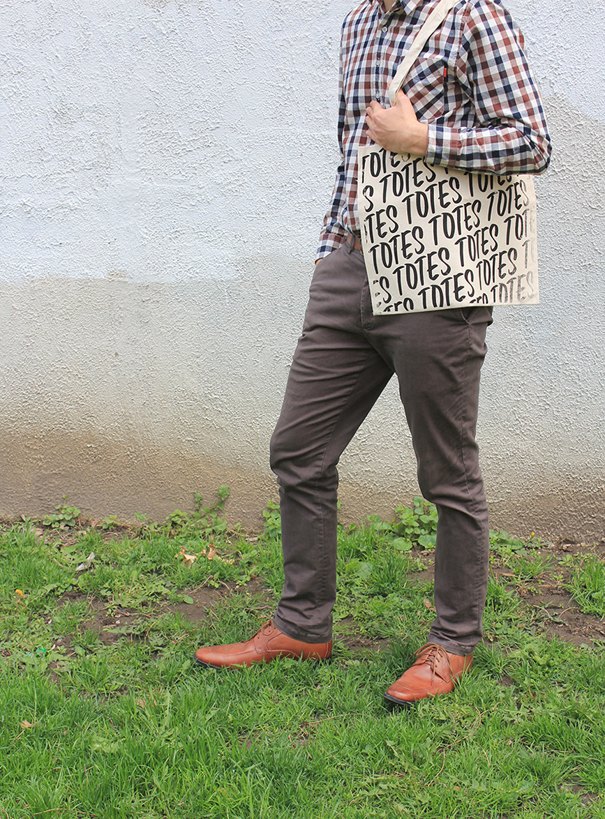
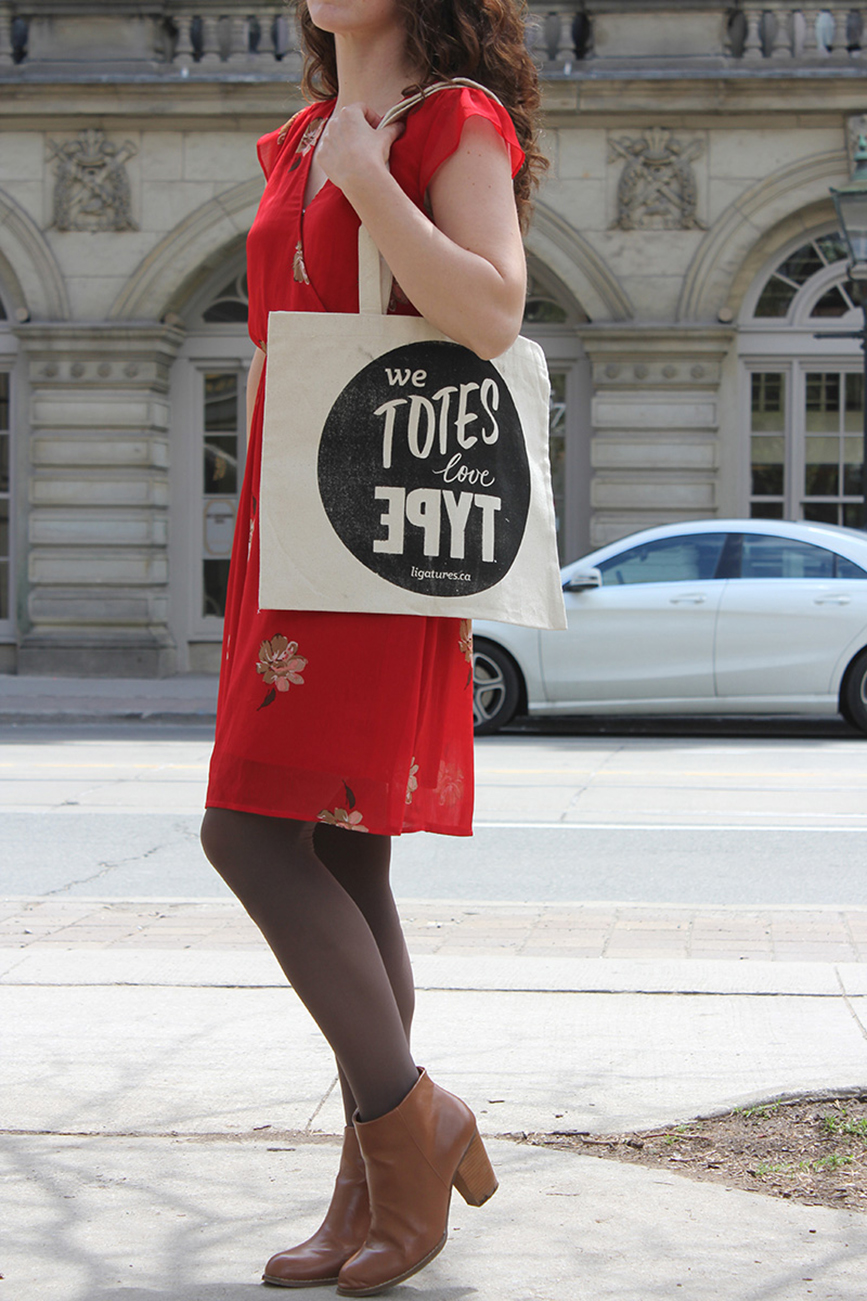

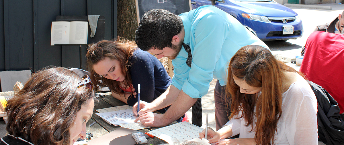
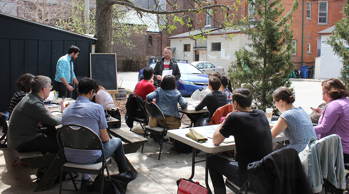
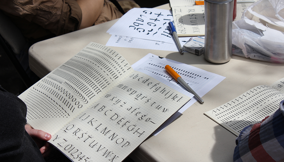
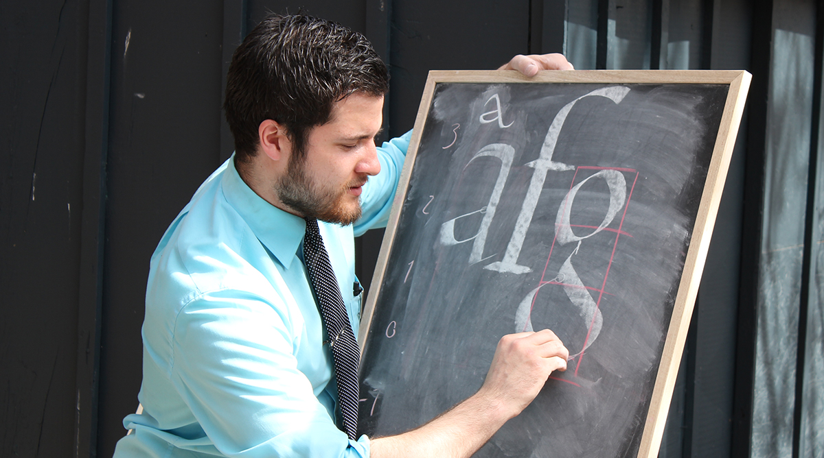
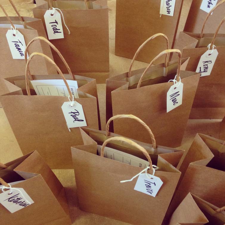
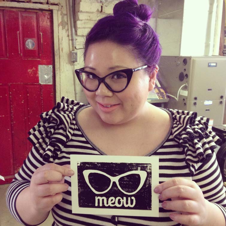
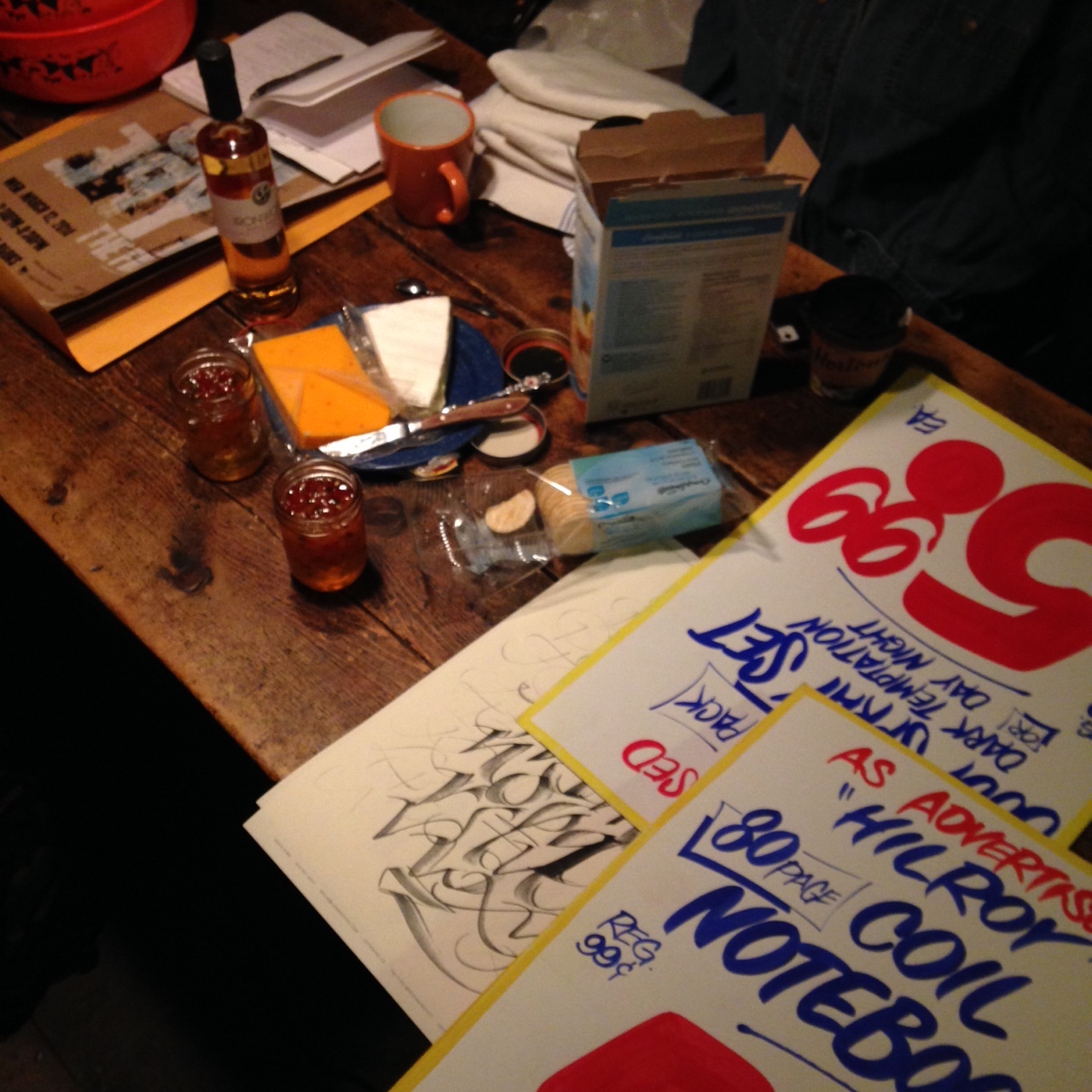
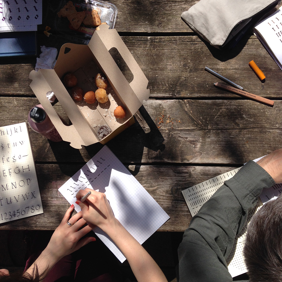 Photo by Christopher Rouleau
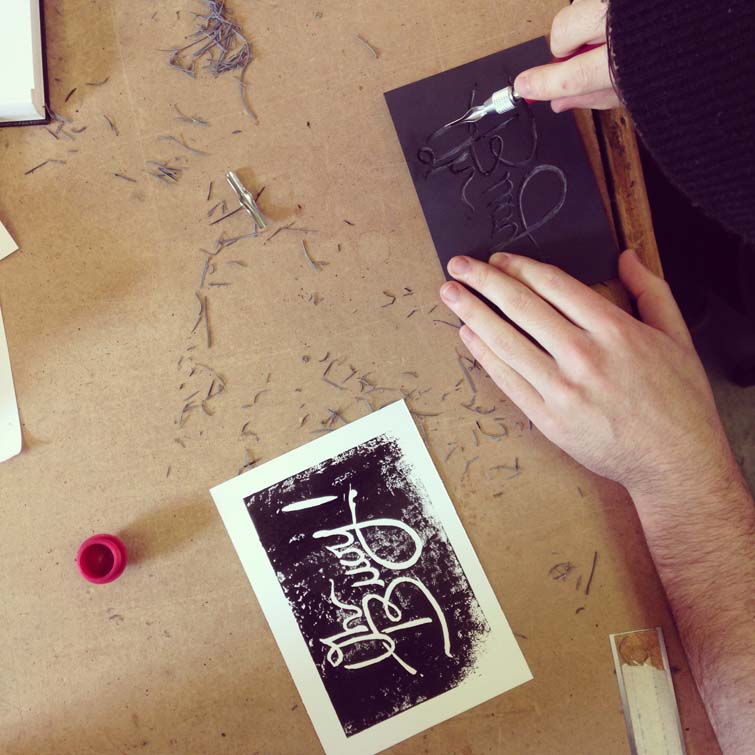
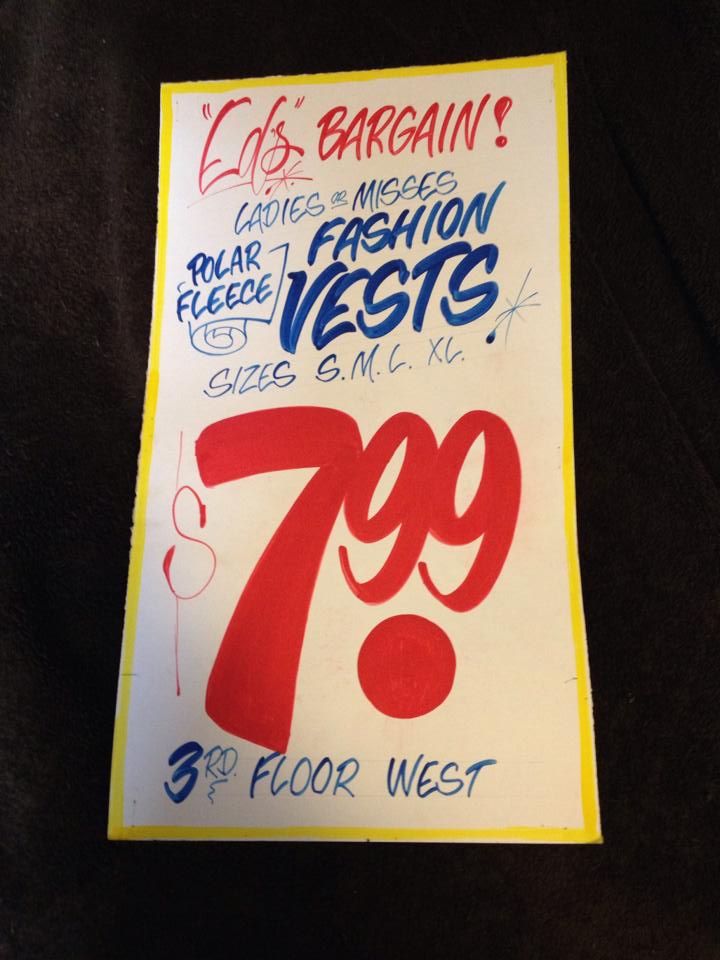
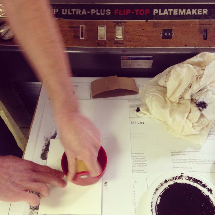
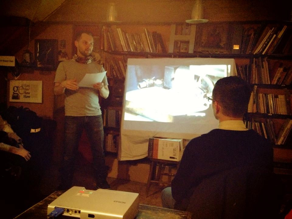
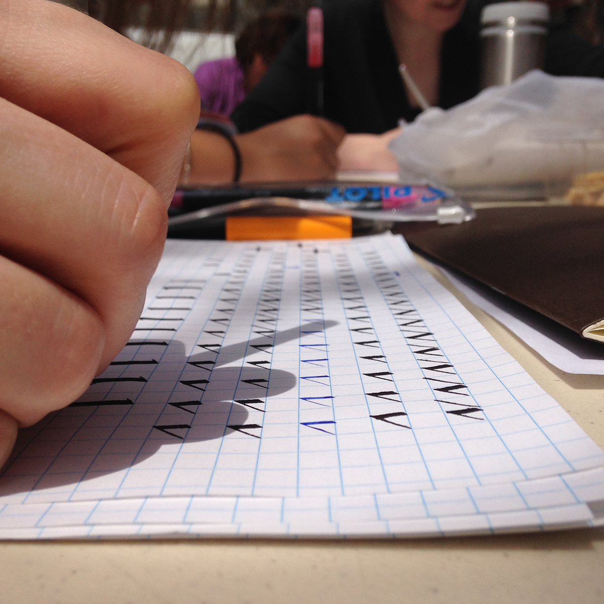 Photo by Christopher Rouleau
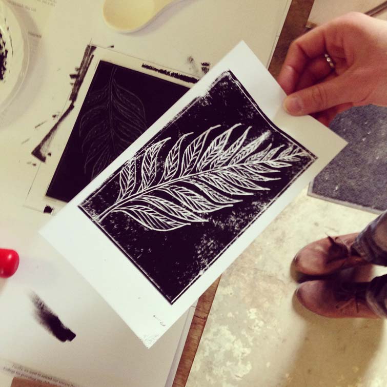
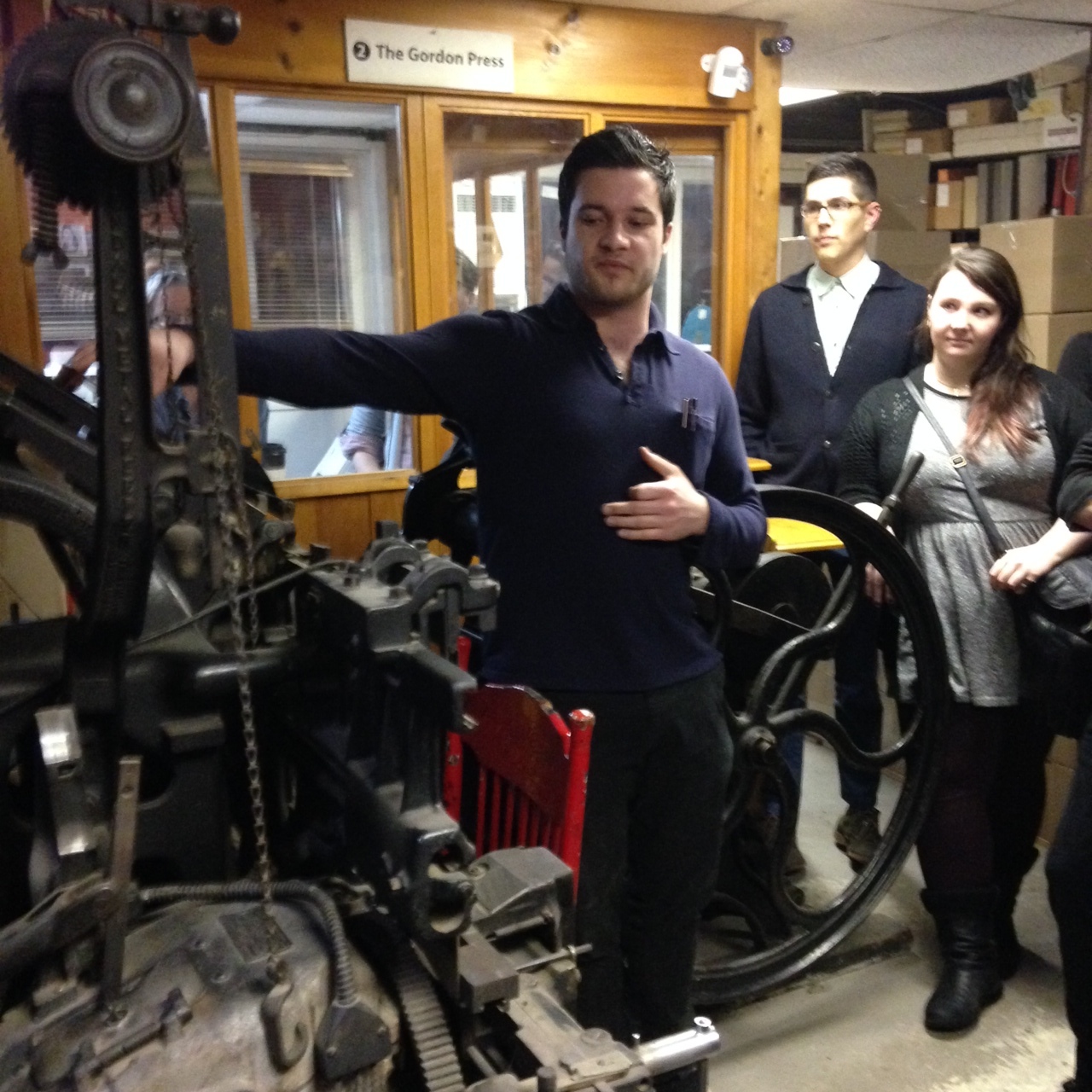